
Ring Product Builder
Choose a stone shape in Build and see its matching setting and stones switch together. This example focuses on assembling a product, without text or image editing.
Explore ten 3D products, including a ring builder, a watch builder with editable straps and a two-sided business card. Compare side-by-side editing, lightbox display, responsive sizes and configurable toolbars.
Creating your own product? The default GLB limit is 100 MB, with 128 mesh parts and 2,000,000 vertices. See the model requirements.
Choose a stone shape in Build and see its matching setting and stones switch together. This example focuses on assembling a product, without text or image editing.

Combine a case, dial and strap in Build. Choose blue leather, grey leather or rubber to unlock artwork editing on the strap, while the other watch parts keep their prepared appearance.

Design the front, back and sleeves in 2D and 3D. Explore saved designs, synchronized colors and editable materials.

Customize the crown and brim with artwork, colors and materials. Explore the latest cap designs in 3D.

Explore wraparound artwork, editable materials and saved designs on a 3D ceramic mug.
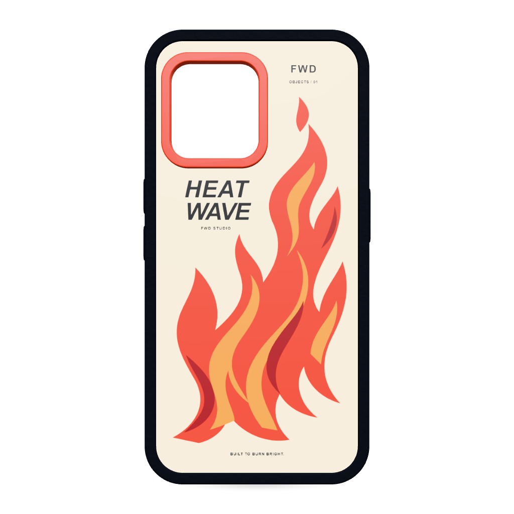
Customize the case in 2D and 3D with shaped artwork, editable colors and materials.

Design both sides of the bag, explore saved designs and customize its colors and materials.

Create independent designs for each side and customize the laces and insole in 3D.

Customize both sides of a soft, furry heart. Start with Love Club or explore Midnight Bloom and Good Energy in Saved Designs.

Open the complete designer on demand and preserve the customer's work when the window is closed.

Edit in 2D and 3D together. Compare left and bottom module bars, with either viewport order.

Keep the 2D canvas and 3D model together, with the module bar below both views.

Compare two independent designer instances adapting to different container widths and heights.

Compare expanded controls, grouped action menus, reduced toolsets and left or bottom module layouts.

See a custom teal interface theme with coordinated controls, panels, highlights and hover states.
Use the documentation to learn how products, views, content libraries, print areas and exports are configured.